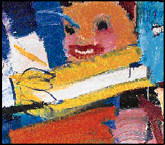
Grace Hartigan's Billboard
|
|
|
Grace Hartigan Introduction |
Style and Technique
Hartigan employs both abstraction and figuration, refusing to see them as mutually exclusive. Inspired by subjects encountered in daily life, she combines abstract and representational forms to create paintings of great visual and emotional power. She describes her subjects as real, but not realistic.
Hartigan drew repeatedly on the accessible imagery and boldly simplified style of American advertising. In Billboard we glimpse a smiling face above a tube of Ipana toothpaste, the neck of a wine bottle poised over a glass, molded lime Jell-O surrounded by fruit, and the keys of a piano. She began the painting by cutting images from Life magazine and pinning them up on the wall in the form of a collage; then she painted the remaining background purple. This collage of commercial, mechanical, and urban imagery became the model for her painting. "I have found my 'subject,'" she said, "it concerns that which is vulgar and vital in American modern life, and the possibilities of its transcendence into the beautiful."
The fragmentary images in Billboard are arranged into an ordered composition unified by Hartigan's bold, expressive brushwork and balanced by her placement of the colors on the canvas. For instance, the large rectangle of purple on the right is balanced by a smaller square of yellow (purple's complement) on the left. The red of the circular apple is intensified by the surrounding green (red's complement). The same green is repeated in the lower right corner, where it takes on a different appearance next to the analogous colors of blue and darker green.
