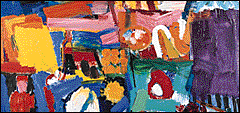
Grace Hartigan's Billboard
|
|
|
Grace Hartigan Introduction |
About the Art
- Do you remember what you saw on your way to school or work today? Maybe you noticed an interesting shape as you passed a store window, the color of a poster at the bus stop, or the patterns made by the lines in the road. Every minute of every day--as we ride to work, watch television, or read a magazine--thousands of images surround us. These images from everyday life are the subject of Grace Hartigan's painting Billboard. Drawing on her experiences in New York in the 1950s, Hartigan incorporated familiar elements of urban America into her work. In this painting, the fragments of figures and forms recall billboard images seen fleetingly from the highway.
- In Billboard Hartigan structured seemingly chaotic images into a unified and ordered composition. She believes that "the rawness must be resolved into form and unity; without the 'rage for order' how can there be art?" Using vivid colors and bold, dynamic brushstrokes, she infused the forms with energy and life, arranging them by size and intensity of color to balance the composition. No part of this painting seems to hold our attention longer than another; our eye wanders from one bright color and interesting shape to the next. Hartigan achieved this effect mainly through the careful use of complementary colors--red and green, blue and orange, yellow and purple. She believes that "you should be able to enter a painting like a promenade--that you should be able to walk in anywhere and walk out anywhere."
