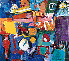
Grace Hartigan's Billboard
|
|
|
Grace Hartigan Introduction |
Art
Grace Hartigan's use of color in Billboard is bold and expressive. Working with various color combinations she assembled the colors into a balanced composition on complementary and analogous colors.
Create a Color Lab
|
|
|
|
Set up a color lab so you can explore color combinations. Use paints, soft crayons, colored transparent cellophane, or other mixable media. Experiment with the three primary colors (red, blue, and yellow) to find formulas for the secondary colors (green, purple, and orange) and the tertiary colors (blue-green, yellow-orange, red-purple, etc.). Add white to the colors to create tints and black to create shades.
Formulate a hypothesis, conduct experiments, record your findings, and draw conclusions based on the results. For instance, record how many drops of yellow must be added (one drop at a time) to ten drops of blue in order to make green. How many drops of blue must be added to ten drops of yellow to make green? Were the yellow and blue mixed in equal amounts? Did everyone come up with the same formula? Discuss.
Experiment with complementary colors. Add one drop of red to ten drops of green. How did the red change the green? What happens when you mix equal amounts of red and green?
Explore Color Intensity
|
|
|
|
Make two squares out of red construction paper, each 1 x 1 inch. Then place one red square in the middle of a 3 x 3-inch square of green and the other in a 3 x 3-inch square of orange. Discuss how the background colors change the appearance of the red. Try many different color combinations.
Explore Color Balance
|
|
|
|
Place a 1 x 1-inch red square on one side of a large sheet of white paper. To balance the red square, cut a green square (any size) and place it on the paper opposite the red one. What size did you make the green square? Was it the same size as the red square? smaller? larger? Experiment with various color combinations.
Create Variations on a Color
![]()
- Create your own color variation study. Pick one primary color and paint a simple composition using only that color and its complementary color. Then paint the same composition using the same primary color and its analogous colors. Repeat the composition a third time, using the primary color, tints (additions of white), and shades (additions of black) to create a monochromatic painting. Then do the same composition a fourth time, as a value study. Use as many different colors as you like, but all must be of the same value or intensity. Compare and contrast the four compositions. Discuss what happens to the primary color in each color variation study.
Create a Mood: City Expressions
|
|
|
|
|
|
Billboard expresses the mood of New York City in the 1950s, when Grace Hartigan lived and worked there. Hartigan worked out the composition for Billboard by making a collage of images taken from Life magazine.
Start with a discussion of collage technique and the principles of collage (overlapping, balance, repetition, contrast). Construct a collage that expresses the mood of the place where you live. You can do this as a group or individually. What objects might express the feel of the town or city? What kinds of lines, shapes, and colors will convey the mood?
Create a painting using your collage as a model. Discuss how the painting and the collage are similar. Discuss how they are different.
Create the Abstract
|
|
|
|
To create the forms in Billboard, Grace Hartigan took naturalistic, or realistic, images from Life magazine and abstracted them-that is, she kept the object's basic shape and color but left out the small details. Take a common object, a chair for example, and abstract it. Discuss the basic form and color of the object. Then draw or paint it in an abstract manner-leaving out details, simplifying, exaggerating, and changing various elements.
Explore the Essence
![]()
Grace Hartigan wished to distill the essence of her subject matter. Discuss the meaning of essence and how Grace Hartigan has conveyed the essence of New York City in Billboard. (Also see Explore) Draw the essence of an object, such as a chair. How do you convey the object's essence? What must you include in the drawing? What can you leave out? Is the essence more than just what you see? What other senses are involved? How has Grace Hartigan conveyed the essence of New York City in Billboard?
Suggested Reading
Cole, Alison. Eyewitness Art: Color. New York: Dorling Kindersley, in association with the National Gallery of Art, Washington, D.C., 1993.
Frayling, Christopher; Helen Frayling; and Ron Van der Meer. The Art Pack. New York: Alfred A. Knopf, 1992.
Yenawine, Philip. Key Art Terms for Beginners. New York: Harry N. Abrams, 1995.
Art
Language Arts
Music
Social Studies
Science
